Back to top

How Better Workplace Navigation Improves Business Efficiency and Visitor Experience

Most businesses think about navigation only when something goes wrong: a visitor wanders into the wrong department, a courier interrupts…

How Better Workplace Navigation Improves Business Efficiency and Visitor Experience

13th November 2026

Most businesses think about navigation only when something goes wrong: a visitor wanders into the wrong department, a courier interrupts a meeting to ask where to drop a package, or a new hire spends their first week asking colleagues where the printer is. Together, these moments add up to a steady drain on staff time and a first impression that no one planned.

Workplace navigation is the set of cues that tells people where they are, where they need to go, and what they can expect when they get there. When it works, nobody notices it. When it doesn’t, the cost shows up in interruptions, delays, and frustrated visitors.

The hidden cost of unclear space

In an office without clear navigation, the people who know the building become the signage. Receptionists, assistants, and whoever happens to be passing the corridor spend part of each day giving directions. This is rarely tracked, which is why it is rarely fixed.

The effect is cumulative. A receptionist who answers the same five directional questions every hour has less attention for the work they were hired to do. And visitors who have to ask at every turn begin to form a view of the company before any conversation has started.

Different spaces ask different things of a visitor

A common mistake is treating the whole floor as one navigation problem. In practice, a commercial building contains several kinds of space, and each one needs the person in front of it to understand something different.

Entry and reception areas carry the heaviest orientation load. A visitor arriving for the first time needs to confirm they are in the right place and see where to go next, ideally before anyone speaks to them.

Meeting and conference rooms need to be found from a distance, often by someone walking while checking a calendar invitation. Clear room identification here prevents the late arrivals and hallway interruptions that derail schedules.

Individual offices and workstations are read at close range by people who already roughly know where they are going and only need final confirmation.

Customer-facing service areas, such as a billing counter or an intake desk, work best when they signal not just who sits there but what happens there. The visitor’s real question is whether this is where they get what they came for.

Staff-only and technical rooms need the opposite approach: a plain identifier that helps authorised people find the space without inviting casual entry from everyone else.

Sorting a floor into these categories turns a vague goal into a concrete list of what each area must communicate.

Fewer questions, fewer interruptions

The most measurable benefit of good navigation is the questions that never get asked. When directions are built into the space, routine enquiries stop landing on reception and on colleagues, and staff time goes back to the work it was meant for.

This also helps in the other direction. Clear identification of service points means customers reach the right desk the first time, which shortens queues and reduces the number of people redirected from one counter to another. For clinics, financial offices, and professional services firms, this is often where wayfinding pays for itself.

Matching the sign to how it is read

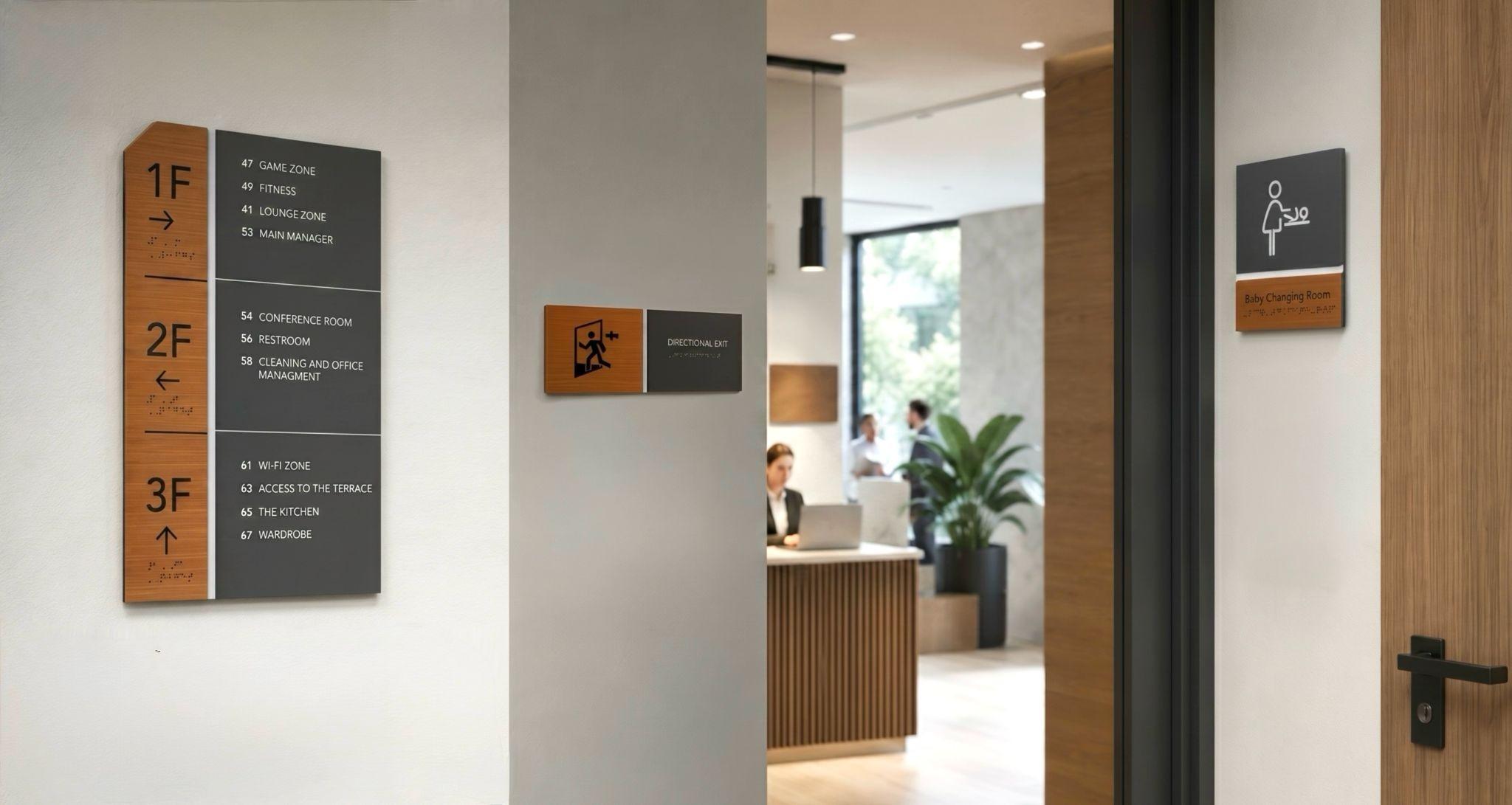
Physical signage is only one part of workplace navigation, alongside floor plans, room naming conventions, and digital booking tools. Size, contrast, material, and mounting should follow from how and where a sign is read, not from a single default applied everywhere.

A reception or directional sign needs larger characters because it is read from across a lobby or along a corridor. A nameplate on a private office is read within arm’s reach and can be smaller, though contrast still matters. And where a sign is tied to a role or rotating desk assignment, a mounting approach that allows the insert to be swapped without disturbing the wall or door finish saves repeated rework.

Suppliers of workplace signage, such as BSign, offer different door sign formats to suit office layouts, viewing distances, and room functions. This allows businesses to maintain consistent visual identification across a floor while adapting individual signs to the needs of each space.

Keeping it coherent

Variety in size and format does not have to mean a patchwork. Shared typography, materials, and finishes tie reception, office, and technical-room signs into one recognisable system, even when each sign is tuned to its own space. Visitors read this consistency as order, and staff benefit from not having to relearn the conventions on every floor.

Common mistakes worth avoiding

Several patterns recur in commercial fit-outs:

  • One template for every door. It looks tidy, but it under-identifies public-facing areas and over-identifies staff-only ones.
  • Ignoring viewing distance. Signs specified without checking how far away they will be read often prove legible only at close range.
  • Choosing mounting before content. Fixed signs in spaces that change often, or swappable hardware on rooms that never change, both waste money.
  • Treating accessibility as uniform. Requirements can differ by sign type and function, so they should be checked against the applicable standard for each category before materials and layouts are finalised.

A practical starting point

Before commissioning anything, walk the floor as a first-time visitor would. Note where you hesitate, where you would have to ask someone, and which rooms you could not identify from a reasonable distance. Then sort the doors into the categories above and, for each one, confirm what the sign must communicate, how far away it will be read, how much handling it will see, and whether its content is likely to change.

That exercise shifts the question from “what should each door say?” to “what does a person standing here need to know?” That is the question that makes a workplace easier to use for the people who work in it and for the people who are only visiting.

Categories: Advice

Our awards

Discover Our Awards.

See Awards

You Might Also Like