-
Blog
-
About us
- Awards
- Issues
- Contact Subscribe
Blog page


Our Top Categories
Reducing Operational Risk With Preventive Maintenance Programs
Top Read In Category
How Workspace Design Defines Company Culture
Top Read In Category
Healthy Budgeting: How Oil-Free Fryers Can Cut Costs in Small Restaurants
Top Read In Category
What Do Attendees Expect From Event Booking Today
Top Read In Category
How Traditional Education Values Support Modern Learning
Top Read In Category
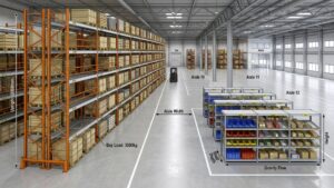
The Strategic Role of Modular Storage Systems in Improving Warehouse Efficiency
Top Read In Category